Power Apps allow you to create responsive apps through specific settings such as deactivating the scaling option. By using templates, activating "Wrap lines" and correctly applying "Minimum width", apps can be dynamically adapted to different screen sizes. These functions optimise the user experience and make apps flexible for mobile devices.
PowerApps offers users the option of dynamically adapting apps to the respective device and screen size and thus building responsive apps.
In the following article, you can find out which settings you should use for this and how you can massively improve the display on mobile devices with 3 simple tips
Tablet or phone - which format is the right one?

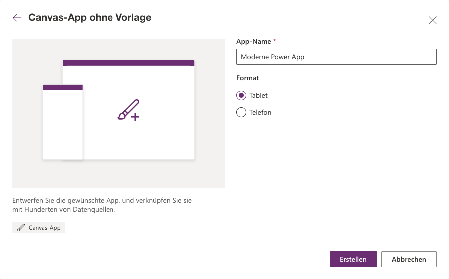
The first step in creating a Power App is to select the format.
As a rule, there is nothing wrong with the "Tablet" format, as most Power Apps are used on desktop and/or tablet PCs. In this case, "Phone" is only suitable if the apps are mainly used on smartphones.
This setting can be changed at any time within the app.
Customise scaling - Why you should deactivate this option
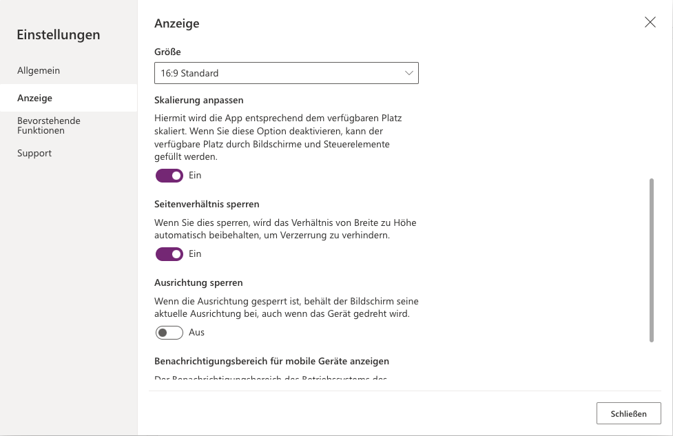
In the settings of your Power Apps, you will find the "Adjust scaling" option under "Display". This controls how the app reacts to different screen sizes.

The following are examples of the various settings:
Adjust scaling - ON
As can be seen here, the application is scaled accordingly for smaller screen sizes. What appears to make sense at first glance, however, results in elements and fonts becoming tiny and the application no longer being usable.
Adjust scaling - OFF
If scaling is switched off, the individual elements are no longer scaled and therefore retain their size. In addition, so-called "breakpoints" are used, which ensure that certain content such as containers are no longer displayed next to each other, but one below the other. This also corresponds to the behaviour of typical responsive websites.
3 tips for better responsive power apps
The following tips show you how you can get the best out of your Mobile Power app in combination with deactivated scaling (adjust scaling: off).
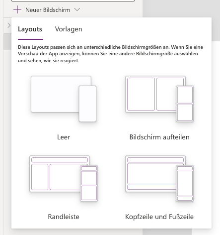
Use templates

When creating a new screen, there are 4 possible layouts to choose from. These are preconfigured containers that are already fully suitable for responsive use. A good starting point for your new Power App.
Activate "Wrap lines"

This option can be activated within a container to enable responsive behaviour depending on the screen width. In combination with the "Minimum width" setting, content above a certain width can be displayed dynamically below instead of next to each other.
Use "Min width" correctly

In combination with "Wrap lines", the minimum width controls the minimum width that an element must have within a container in order to be displayed next to each other. If the elements would become smaller than the minimum width when collapsed, they are wrapped instead and displayed one below the other in the full available width.
In the following example, a minimum width of 300 pixels is configured for both the orange and the blue container.
You can see that if this minimum width is not reached, the lines are wrapped so that the containers now appear one below the other.
novalutions - Power Apps Agency Cologne
novalutions combines in-depth expertise in SharePoint development with customised solutions to make your business processes more efficient and transparent.
Responsive apps - a conclusion
As you can see, Power Apps are in no way inferior to classic native apps or websites when it comes to display on mobile devices.
We hope this article helps you to create your next Power App.
Leave us a comment if you have any questions or requests for further blog posts.

Contact us
Hi, I am Jérémie - Expert for PowerApps
With Power Apps can The company Business applications and -processes digitise and these Apps simple itself Manage and develop further. Gladly support we you with Workshops, Training courses or Development support with yours Digitisation project. The Initial consultation is with us free of charge, so hesitate not us to contact us!
0221 - 42317679
We look forward to your enquiry. We are ready for innovationyour growthsuccess.
Questions & Answers
Frequent Questions to Responsive Power Apps
Which Power Apps format is better, tablet or phone?
Even if this setting could change later, we recommend the "Phone" format for apps that are mainly used on phones, and the "Tablet" format for apps that are mainly used on larger devices.
If your app is used equally on all devices, then select "Tablet" as the workspace for app development is larger there, which simplifies the work.
What are Power Apps Containers used for?
In Power Apps, "containers" are used to group and organise elements on a user interface. They help with the design of responsive layouts that adapt to different screen sizes.
The main difference between horizontal and vertical containers lies in the alignment of the elements:
- Horizontal containers arrange their child elements next to each other in a row.
- Vertical containers place their child elements one below the other in a column.
This differentiation enables developers to intuitively adapt the layout to the requirements of the application.
How do I create a responsive layout in Microsoft Power Apps?
To create a responsive layout in Power Apps, use containers such as horizontal and vertical containers to arrange elements dynamically. Also use relative units of measurement to display the app correctly on different devices.
How do I adjust the font size in Power Apps for different devices?
Use the "FontSize" property and set it to formulas based on the screen size, such as App.Width/20.
How to create a responsive gallery in Power Apps?
Use a flexible height and width for the gallery elements and set the properties to percentage values to ensure that the gallery automatically adapts to different screen sizes.
How do you design a responsive form in Power Apps?
Use the "Form" control and adjust the layout settings such as number of columns based on the screen size.
In the "Number of columns" property, you can use the following formula, for example, to make a form 3-column on the desktop and 1-column on mobile devices:
If(App.Width > 1024;3;1)
How to create a responsive menu in Power Apps?
To do this, select the "Tab list" element. On desktop views, select the "Horizontal" orientation on mobile devices the "Vertical" orientation


What exactly happens when you deactivate scaling? Does it work similarly on all devices or are there differences?
Hello Cihan. The "scaling" is basically a zoom function. Without "scaling", the app uses the additional space on large devices to display more elements.
With scaling, a small app is simply displayed larger on desktop devices and does not utilise the additional space effectively and is therefore not responsive.